
Table of Contents
Table of Contents
WordPress Accessibility: The Complete 2026 Guide to Building an ADA & WCAG Compliant Website
If you build or manage a WordPress website, accessibility is no longer something you can afford to ignore. It has become an essential part of creating websites that work well for everyone—not just for visitors with disabilities, but for every person who lands on your site.
When people hear the term website accessibility, they often assume it only applies to government websites or large corporations. In reality, every business website can benefit from making its content easier to use. Whether someone is navigating with a keyboard, relying on a screen reader, dealing with low vision, or simply browsing on a mobile device in bright sunlight, an accessible website creates a smoother experience.
As someone who has worked on WordPress projects for businesses of different sizes, I’ve noticed that accessibility is often overlooked during development. Most site owners focus on design, speed, and SEO, but accessibility usually becomes an afterthought—or worse, it’s only considered after receiving customer complaints or learning about legal requirements.
The good news is that improving accessibility doesn’t always require rebuilding your website from scratch. In many cases, small improvements can make a significant difference.
In this guide, I’ll walk you through the practical steps you can take to make your WordPress website more accessible. We’ll cover choosing the right theme, improving navigation, fixing forms and images, testing your website, and understanding the accessibility standards that matter in 2026.
WordPress Accessibility: The Complete 2026 Guide to Building an ADA & WCAG Compliant Website
Accessibility isn’t just about following a checklist. It’s about removing barriers that prevent people from using your website.
According to the World Health Organization, more than a billion people worldwide live with some form of disability. Some visitors may have limited vision, others may rely on screen readers, while some cannot use a mouse and navigate entirely with a keyboard. If your website isn’t designed with these users in mind, they may struggle—or simply leave and look elsewhere.
For businesses, accessibility also makes good commercial sense. A website that’s easier to use usually performs better across the board. Visitors stay longer, complete more forms, and are less likely to abandon your pages because of usability issues.
Here are a few reasons why accessibility deserves your attention.
It helps you reach more people
Every visitor should have the opportunity to access your products, services, or content. An accessible website welcomes users with different abilities instead of unintentionally excluding them.
It supports better SEO
Many accessibility best practices overlap with search engine optimization. For example:
- Descriptive image alt text
- Proper heading structure
- Meaningful link text
- Faster page loading
- Mobile-friendly layouts
These improvements help both search engines and real users understand your content more effectively.
It reduces legal risk
Website accessibility regulations continue to evolve around the world. Businesses operating in the United States, Europe, Canada, and many other regions are increasingly expected to provide websites that meet recognized accessibility standards such as WCAG.
While not every business faces the same legal obligations, making accessibility part of your website strategy is far easier—and often less expensive—than addressing complaints later.
It improves usability for everyone
One of the biggest misconceptions is that accessibility only benefits people with disabilities. In reality, many accessibility improvements help every visitor.
- Captions are useful when someone watches a video without sound.
- Larger buttons make mobile browsing easier.
- Clear navigation helps first-time visitors find information faster.
- Good contrast improves readability in bright sunlight.
- Simple language makes content easier to understand for both native and non-native English speakers.
Accessibility is really another way of improving user experience.
It builds trust
People notice when a website feels easy to use. Clean navigation, readable text, accessible forms, and thoughtful design all contribute to a positive first impression. They show that your business pays attention to quality and cares about every visitor—not just the average user.
Common WordPress Accessibility Mistakes to Avoid
Over the years, I’ve audited WordPress websites built with page builders, premium themes, and custom code. Interestingly, the same accessibility problems appear again and again.
The encouraging part is that many of these issues are straightforward to fix once you know what to look for.
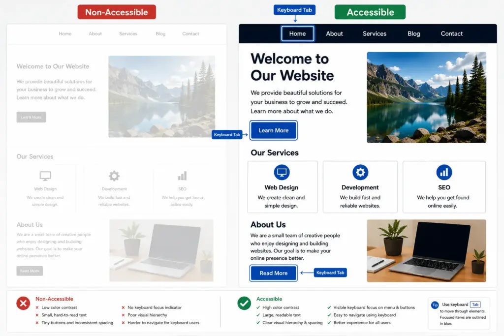
Low color contrast
Light gray text on a white background might look modern, but it can be difficult—or even impossible—for many people to read.
Always check that your text has enough contrast against its background. A beautiful design isn’t very useful if visitors have to strain to read it.
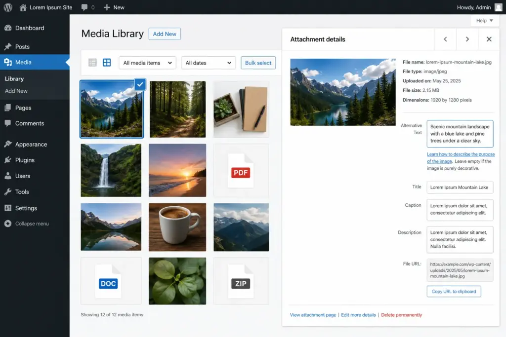
Missing image alt text
Uploading images without meaningful alternative text is probably one of the most common accessibility mistakes in WordPress.
Instead of leaving the field empty or accepting filenames like:
IMG_4582.jpgdescribe what the image communicates. For example: “Customer completing an online checkout using a WooCommerce store.”
If an image is purely decorative, leave the alt text empty so screen readers skip it.
Generic links
Links that simply say:
- Click here
- Read more
- Learn more
don’t provide enough context for screen reader users.
Instead, write descriptive links such as:
- Download the accessibility checklist
- View our WordPress maintenance plans
- Read the WooCommerce migration guide
Visitors instantly understand where each link will take them.
Poor keyboard navigation
Many websites work perfectly with a mouse but become frustrating when navigating with only a keyboard.
Common issues include:
- Inaccessible menus
- Hidden focus indicators
- Popup windows that trap keyboard users
- Sliders that cannot be controlled without a mouse
A simple keyboard test often reveals problems that automated tools completely miss.
Forms without proper labels
Forms should clearly identify every field. Relying only on placeholder text is a common mistake because the text disappears as soon as users begin typing. Every field should have a visible label that’s correctly associated with the input.
Accessibility overlay widgets
Many businesses install an accessibility widget and assume the job is finished. Unfortunately, that’s rarely true.
These tools may provide helpful features like text resizing or contrast adjustments, but they cannot fix poorly written HTML, missing form labels, incorrect heading structures, or inaccessible navigation.
Think of overlays as optional enhancements—not replacements for accessible development.
Ignoring accessibility after launch
Accessibility isn’t something you complete once and forget. New plugins, theme updates, fresh landing pages, or even a simple content edit can introduce new accessibility issues.
That’s why I recommend reviewing accessibility as part of your regular website maintenance, just as you would check backups, security updates, or performance.
Choose an Accessibility-Ready WordPress Theme
Accessibility starts long before you add your first page or install your favorite plugins. It begins with the theme you choose.
I’ve worked on projects where clients wanted accessibility improvements, but the theme itself created unnecessary obstacles. Missing keyboard support, poor heading structure, and low-contrast design elements meant we had to spend extra time fixing problems that could have been avoided from the start.
Choosing a well-built theme won’t make your website fully accessible on its own, but it gives you a solid foundation.
WordPress.org includes an Accessibility Ready tag for themes that meet a set of accessibility guidelines. While it’s not a guarantee that every part of your website will be compliant, it’s a good place to begin.
What should you look for?
Before selecting a theme, check whether it offers:
- Good color contrast between text and backgrounds
- Proper semantic HTML (header, nav, main, footer, etc.)
- Full keyboard navigation
- Visible focus indicators when tabbing through links
- Responsive layouts that remain usable at 200% zoom
- Menus that work without requiring a mouse
- Support for screen readers
If you’re customizing colors and typography, remember that even an accessibility-ready theme can become inaccessible if branding choices reduce readability.
Themes I regularly recommend
While dozens of themes claim to be accessible, these consistently perform well.
| Theme | Why It’s Popular |
|---|---|
| Astra | Lightweight, flexible, works well with Elementor and Gutenberg |
| GeneratePress | Excellent code quality and semantic markup |
| Twenty Twenty-Four | Built by the WordPress team with accessibility in mind |
| Neve | Fast, mobile-friendly, and easy to customize |
No matter which theme you choose, don’t assume it’s perfect. Test it yourself after customization.
A quick keyboard walkthrough and a Lighthouse accessibility scan can reveal issues before your visitors do.
Improve Navigation & Site Structure
When someone lands on your website, they should be able to understand its structure without thinking about it.
The same principle applies to search engines and screen readers. A clean page structure helps everyone find information faster.
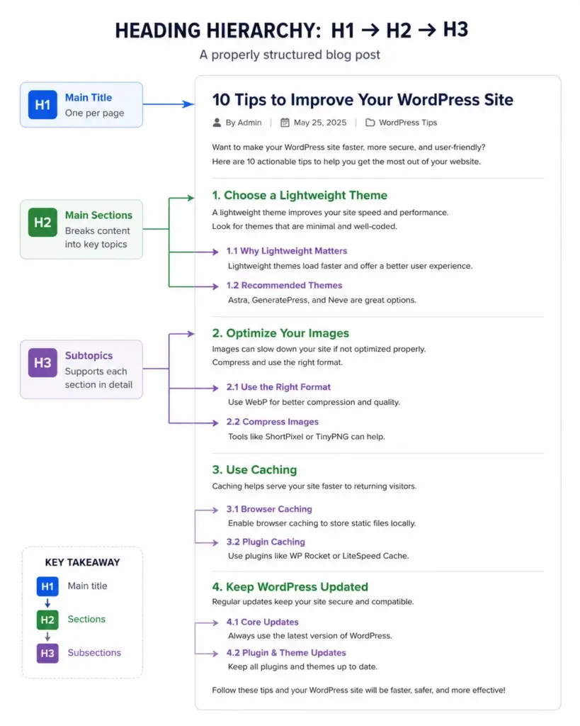
Use headings correctly
One mistake I see frequently is using headings simply because they “look nice.” For example:
H1
H4
H2
H5
Visually, this might seem fine. For someone using a screen reader, however, it creates confusion because the content hierarchy no longer makes sense.
Instead, organize headings logically.
H1
 ├── H2
      ├── H3
      ├── H3
 ├── H2
      ├── H3
Every page should have one primary H1, followed by H2s and H3s where appropriate. Think of headings as the table of contents for your page.
Add a Skip to Content link
Keyboard users shouldn’t have to tab through fifteen navigation links every time they visit a new page. A simple Skip to Content link allows users to jump directly to the main content.
Many accessibility-ready themes already include this feature, but if yours doesn’t, it’s worth adding. It’s a small improvement that makes a huge difference.
Keep navigation predictable
Visitors expect menus to behave consistently. Avoid hiding essential pages behind complicated animations or hover-only menus.
Ask yourself:
- Can someone open every menu using only a keyboard?
- Does the focus move logically?
- Is the current page clearly highlighted?
- Are dropdown menus easy to close?
If the answer is “no,” your navigation probably needs attention.
Use semantic HTML
Instead of wrapping everything in endless <div> elements, use meaningful HTML wherever possible. For example:
<header>
<nav>
<main>
<section>
<article>
<footer>
These elements provide valuable information to assistive technologies and search engines.
Fortunately, most modern WordPress themes already support semantic markup, but custom templates and page builder layouts should still be reviewed.
Don’t rely on color alone
Imagine a required field that’s only marked in red. Someone with color blindness may never notice.
Instead, combine color with text, icons, or symbols. For example:
- ❌ Required fields shown only in red.
- ✅ Required fields marked with an asterisk and the word Required.
Small improvements like this significantly improve usability.
Optimize Images for Accessibility (and Better SEO)
Images make websites more engaging, but they can also become barriers if they’re not handled properly.
The easiest place to start is alt text.
Write meaningful alt text
A common mistake is treating alt text as another place to insert keywords. Instead, describe the purpose of the image. For example:
❌ wordpress website image seo accessibility plugin business website
That’s not helpful. A better version would be:
“Developer testing a WordPress website using an accessibility checker.”
That tells screen reader users what the image communicates.
Decorative images don’t need descriptions
Not every image needs alt text. If you’re using decorative background shapes, divider graphics, or icons that don’t add information, leave the alt attribute empty:
alt=""This tells assistive technology to ignore the image instead of reading unnecessary information aloud.
Charts and infographics need extra context
Complex visuals often contain too much information for a short alt description. If you’re sharing:
- Statistics
- Comparison tables
- Flowcharts
- Infographics
include a written explanation nearby. Doing so helps both accessibility and SEO, since search engines can understand text more easily than images.
Don’t forget videos
Video accessibility is often overlooked. Whenever possible:
- Add captions.
- Provide transcripts for educational content.
- Avoid autoplay with sound.
- Include playback controls.
These improvements benefit far more people than just those with hearing impairments. Many users watch videos in quiet offices, libraries, or public transport without audio.
Optimize image performance too
Accessibility isn’t only about screen readers. Large, unoptimized images can make websites painfully slow, especially for visitors using slower internet connections or older mobile devices.
Before uploading images:
- Compress them.
- Resize them appropriately.
- Use modern formats like WebP where possible.
- Enable lazy loading.
Fast websites are easier for everyone to use.
A quick image checklist
Whenever I review a WordPress website, I ask these questions:
- ✔ Does every important image have meaningful alt text?
- ✔ Are decorative images ignored by screen readers?
- ✔ Are image file sizes optimized?
- ✔ Are videos captioned?
- ✔ Can users understand charts without relying only on visuals?
If you can answer “yes” to these questions, you’re already ahead of many websites.
Make Forms Accessible
Forms are often the most important part of a website. Whether you’re collecting leads, booking appointments, processing orders, or handling support requests, forms are usually where visitors take action.
Unfortunately, they’re also one of the most common accessibility problem areas I encounter when auditing WordPress websites.
A form might look perfectly fine visually, yet be difficult—or impossible—for some users to complete.
Use proper labels for every field
One mistake I frequently see is relying entirely on placeholder text. For example:
❌ <input type="email" placeholder="Enter your email">The problem is that the placeholder disappears as soon as the user starts typing.
A better approach is:
✅ <label for="email">Email Address</label>
<input type="email" id="email">
This helps screen readers identify the field correctly and improves usability for everyone.
Make error messages clear
Nobody enjoys submitting a form only to see: “An error occurred.”
Which field? What needs fixing? How can the user resolve it?
Instead, provide specific feedback. Good example:
- ✅ “Please enter a valid email address.”
- ✅ “Phone number is required.”
The clearer the message, the easier it is for users to complete the form successfully.
Don’t rely only on color
Many forms highlight errors using red borders alone. The issue is that some users may not notice the color difference.
Combine color with:
- Icons
- Text labels
- Clear instructions
For example:
- ❌ Red border only
- ✅ Red border + “Required field” message
Group related fields
If your form contains multiple related inputs, such as billing information or shipping details, group them logically.
This helps screen readers understand the relationship between fields. Examples include:
- Billing Address
- Shipping Address
- Contact Information
- Payment Details
Good organization improves both accessibility and completion rates.
Test forms yourself
Whenever I launch a website, I always test forms manually. Try:
- Using only the keyboard
- Navigating with the Tab key
- Triggering validation errors
- Completing the form on mobile
You’ll often discover issues that automated tools completely miss.
Improve Links & Buttons
Links and buttons guide visitors through your website. If they’re unclear, people get lost. If they’re inaccessible, some users can’t interact with them at all.
Stop using “Click Here”
This is one of the oldest usability mistakes on the web. Imagine a screen reader user hearing: Click Here, Click Here, Click Here, Click Here.
None of those links provide context. Instead, describe the destination. Better examples:
- ✅ Download our WordPress Accessibility Checklist
- ✅ View Website Maintenance Plans
- ✅ Request a Free Accessibility Audit
Descriptive links help both users and search engines.
Make links visually obvious
Links shouldn’t be identifiable by color alone. Many websites remove underlines for design reasons. The result? Visitors often can’t tell what’s clickable.
A simple underline dramatically improves usability. When in doubt:
- Keep links underlined inside content.
- Use clear hover states.
- Ensure sufficient color contrast.
Create larger touch targets
Small buttons might look elegant on desktop. On mobile, they’re frustrating. Visitors shouldn’t have to zoom in just to tap a button.
As a general rule:
- Buttons should be easy to tap.
- Links shouldn’t be crowded together.
- Interactive elements need breathing room.
Accessibility often improves mobile usability at the same time.
Inform users about new tabs
Opening links in a new tab isn’t necessarily bad. The problem is doing it without warning.
Whenever possible, indicate when a link opens elsewhere. For example: Download Accessibility Guide (opens in new tab).
This prevents confusion and helps users maintain orientation.
Write Accessible Content
Accessibility isn’t only about code. Content plays a huge role. I’ve reviewed technically accessible websites that were still difficult to understand because the content itself created barriers.
Use clear language
You don’t need to oversimplify your expertise. You simply need to communicate clearly.
Ask yourself: Would a first-time visitor understand this? If the answer is no, rewrite it.
Shorter sentences and straightforward explanations often perform better than industry jargon.
Break up large blocks of text
Huge paragraphs can be overwhelming. Instead, use:
- Headings
- Bullet points
- Numbered lists
- Short paragraphs
This improves readability for everyone, especially users with cognitive disabilities. As a bonus, it usually increases engagement and time on page.
Structure content correctly
A common mistake in page builders is using visual styling instead of proper HTML structure. For example:
- ❌ Making text bold and large to look like a heading.
- ✅ Using actual H2 and H3 tags.
Screen readers depend on proper structure to navigate content efficiently.
Make tables understandable
Tables should present data—not be used for layout. When using tables:
- Include table headers.
- Keep structure simple.
- Avoid merging large numbers of cells.
Complex tables can become difficult for assistive technologies to interpret.
Avoid directional instructions
Consider this sentence: Click the blue button on the right.
What if the button isn’t blue? What if the layout changes on mobile?
Instead write: Click the “Get Started” button.
The instruction remains clear regardless of screen size or design changes.
Best WordPress Accessibility Plugins
Plugins can help identify and solve accessibility issues faster. However, they should support your accessibility efforts—not replace them.
WP Accessibility
One of the longest-standing accessibility plugins in the WordPress ecosystem. Helpful features include:
- Skip links
- Language attributes
- Focus improvements
- Accessibility enhancements
It’s often a good starting point for existing websites.
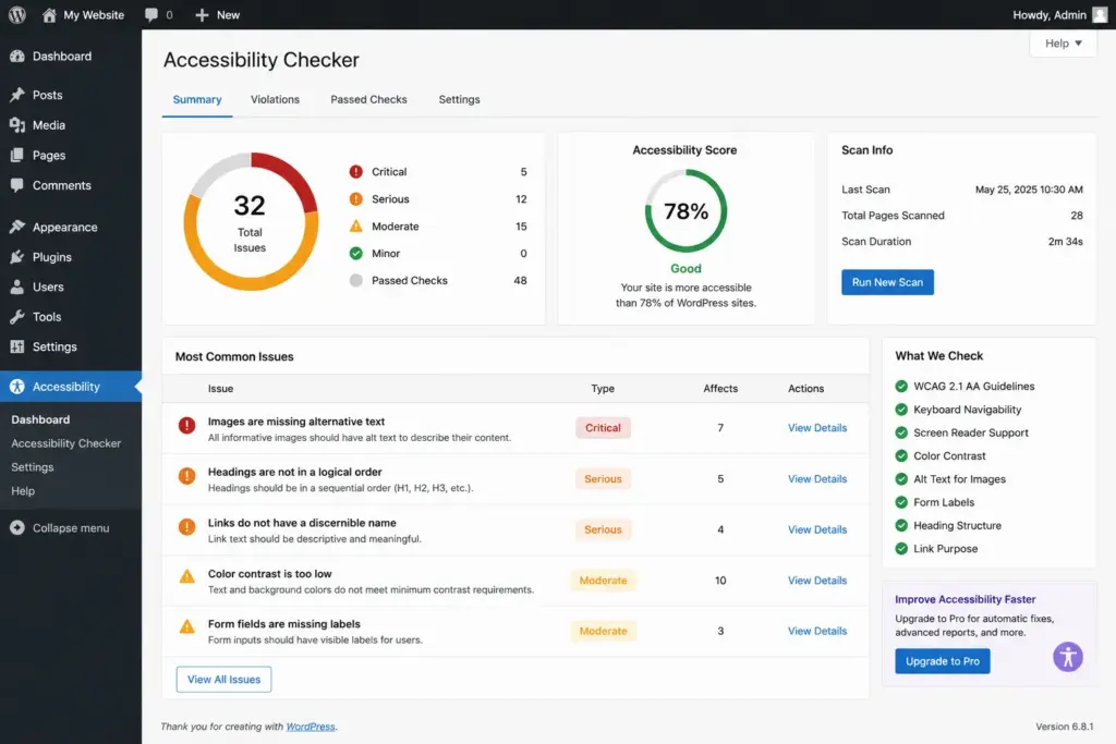
Accessibility Checker
This plugin scans pages and highlights potential WCAG issues directly inside WordPress. It can help identify:
- Missing alt text
- Empty links
- Heading problems
- Contrast concerns
For content-heavy websites, it saves a significant amount of time.
WAVE Browser Extension
Although technically not a WordPress plugin, WAVE is one of my favorite accessibility testing tools. It provides a visual breakdown of:
- Errors
- Alerts
- Structural elements
- Accessibility features
I use it regularly during audits.
axe DevTools
Another excellent option for developers. It helps identify accessibility issues during development and testing. Many agencies use it as part of their quality assurance process.
A quick warning about overlay tools
You’ve probably seen accessibility widgets that promise: “One-click ADA compliance.” Be careful.
No plugin can automatically fix:
- Poor content structure
- Missing labels
- Bad navigation
- Incorrect HTML
- Broken keyboard accessibility
These tools may provide useful features, but they are not a substitute for proper development. Accessibility is ultimately a combination of design, content, code, and testing.
Test Your WordPress Website for Accessibility
One of the biggest misconceptions about accessibility is that installing the right plugin is enough. It isn’t.
In my experience, automated tools are excellent for spotting common problems, but they only catch part of the picture. Things like keyboard navigation, confusing form labels, poor reading order, or inconsistent focus states often require manual testing.
If accessibility is important to your website—and it should be—make testing part of your regular maintenance routine.
Start with Automated Testing
Automated tools are the quickest way to identify obvious issues before you begin a deeper review. Some of the tools I use most often include:
WAVE
WAVE gives you a visual overview of accessibility problems directly on your webpage. It highlights issues such as:
- Missing alternative text
- Empty links
- Missing form labels
- Poor heading structure
- ARIA-related problems
It’s beginner-friendly and an excellent starting point.
Google Lighthouse
If you use Google Chrome, you already have Lighthouse built into the browser. Open Developer Tools, run a Lighthouse report, and you’ll receive an accessibility score along with recommendations for improvement.
Remember, though—a high score doesn’t necessarily mean your website is fully accessible. Lighthouse focuses on measurable technical checks rather than real-world usability.
axe DevTools
For developers, axe DevTools is one of the most reliable accessibility testing extensions available. It provides detailed explanations for each issue, making it easier to understand not only what is wrong but why it matters.
When working on client projects, I often run both Lighthouse and axe because they complement each other well.
Don’t Skip Manual Testing
This is where many hidden issues appear. I always recommend spending ten to fifteen minutes navigating your own website as if you couldn’t use a mouse. It can be surprisingly eye-opening.
Test with only your keyboard
Put your mouse aside and try navigating using:
- Tab
- Shift + Tab
- Enter
- Spacebar
- Arrow keys
Ask yourself:
- Can you reach every menu item?
- Is the keyboard focus always visible?
- Can you submit forms?
- Can dropdown menus be opened and closed?
- Is there anywhere you become “trapped” and can’t continue?
If keyboard users struggle, there’s a good chance many visitors will too.
Test at 200% Zoom
Many users increase browser zoom to improve readability. Zoom your website to 200% and carefully inspect every page. Look for:
- Text overlapping images
- Buttons disappearing
- Horizontal scrolling
- Broken layouts
- Hidden navigation
A responsive website isn’t automatically an accessible one.
Check Color Contrast
Beautiful branding shouldn’t come at the expense of readability. I’ve seen many websites use light gray text because it looks modern, but it becomes difficult to read, especially for visitors with low vision.
Always verify that text, buttons, icons, and links have enough contrast against their backgrounds. Small adjustments to color can dramatically improve readability without changing your overall design.
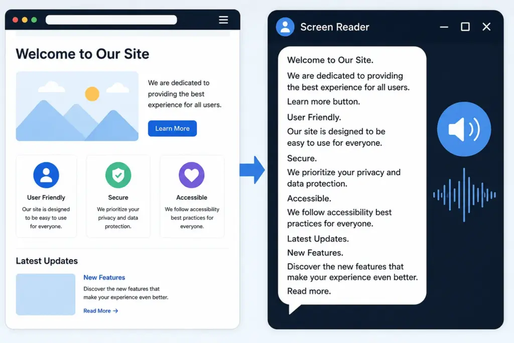
Test with a Screen Reader
This step often changes how people think about accessibility. Turn on a screen reader and listen to your website instead of looking at it. Popular options include:
- NVDA (Windows)
- VoiceOver (built into macOS and iPhone)
- JAWS (Windows)
Pay attention to questions like:
- Does the page title make sense?
- Are headings announced in the correct order?
- Do links describe where they go?
- Are images explained appropriately?
- Can forms be completed independently?
You don’t need to become a screen reader expert. Even fifteen minutes of testing can reveal usability problems that automated scanners never detect.
A Simple WordPress Accessibility Audit
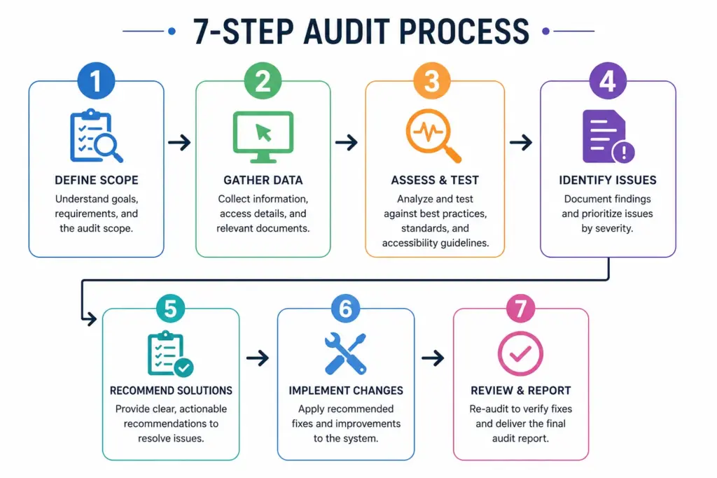
Whenever a client asks me to review their website, I follow the same basic process. You don’t need expensive software or a specialist team to get started.
Here’s a practical workflow you can use on almost any WordPress website.
Step 1: Run an Automated Scan
Start with WAVE, Lighthouse, or Accessibility Checker. Don’t worry about fixing everything immediately. Instead, create a list of recurring issues. Common examples include:
- Missing alt text
- Empty buttons
- Low color contrast
- Missing labels
- Incorrect heading order
This gives you a clear starting point.
Step 2: Fix the Easy Wins
Some improvements take only a few minutes. For example:
- Add missing alt text.
- Rename vague links.
- Correct heading hierarchy.
- Label form fields.
- Improve button contrast.
These small changes often have a noticeable impact on both accessibility and SEO.
Step 3: Navigate Without a Mouse
Now complete your most important tasks using only the keyboard. Try to:
- Browse your homepage
- Open navigation menus
- Search your website
- Submit a contact form
- Complete a purchase (if applicable)
If you struggle, your visitors probably will too.
Step 4: Review Every Important Page
Focus on pages that matter most to your business. Examples include:
- Home
- About
- Services
- Product pages
- Blog posts
- Contact page
- Checkout page
These pages generate the majority of traffic and conversions. Improving them first provides the greatest return.
Step 5: Check Mobile Accessibility
Accessibility isn’t limited to desktop users. Open your website on different mobile devices and check:
- Button size
- Font readability
- Menu navigation
- Form usability
- Touch spacing
Many accessibility issues become much more obvious on smaller screens.
Step 6: Test After Every Major Update
Accessibility isn’t a one-time project. Every new plugin, redesign, landing page, or WooCommerce update has the potential to introduce new issues.
I recommend including accessibility checks alongside your regular maintenance tasks, just like backups, security updates, and performance testing. It’s much easier to prevent problems than fix dozens of them later.
Understanding Accessibility Standards
One question I hear quite often is: “Do I actually need to comply with accessibility laws?”
The answer depends on where your business operates, who your customers are, and whether you’re working in a regulated industry.
Even if you’re not legally required today, following recognized accessibility standards is still a smart investment. It helps you create a better website while reducing future risks.
ADA (Americans with Disabilities Act)
If your business serves customers in the United States, you’ve probably heard of the ADA. Although the law doesn’t specifically mention websites, many courts have interpreted business websites as part of a company’s public services.
As a result, accessibility-related legal cases have continued to increase over the past several years. For many businesses, aligning with recognized accessibility standards is the safest long-term approach.
WCAG
The Web Content Accessibility Guidelines (WCAG) are considered the global benchmark for accessible websites. They are built around four core principles. A website should be:
- Perceivable – Information should be available in ways people can see or hear.
- Operable – Visitors should be able to use the website with different input methods, including a keyboard.
- Understandable – Navigation and content should be clear and predictable.
- Robust – The website should work reliably with assistive technologies.
For most WordPress websites, WCAG 2.1 Level AA is the practical standard to aim for.
Section 508
Section 508 mainly applies to U.S. federal agencies and organizations that receive federal funding. If you’re building websites for government clients, understanding these requirements is especially important.
EN 301 549
Organizations serving customers in the European Union may also need to consider EN 301 549, which references WCAG for digital accessibility. It’s particularly relevant for public sector organizations and businesses working with government contracts.
AODA
Businesses operating in Ontario, Canada, should also be aware of the Accessibility for Ontarians with Disabilities Act (AODA). Many organizations are required to meet WCAG-based accessibility standards.
Don’t Treat Accessibility as a Legal Checklist
It’s easy to focus only on compliance. But accessibility is ultimately about creating a better experience for every visitor.
A website that’s easier to navigate, easier to read, and easier to understand usually performs better in search engines, converts more visitors, and reflects positively on your business.
Legal compliance is important—but great usability should always be the bigger goal.
Frequently Asked Questions
Is WordPress accessible out of the box?
Not completely. WordPress itself has made significant improvements to accessibility over the years, and the core platform includes many accessibility-friendly features. However, your website’s accessibility depends on much more than WordPress alone.
The theme you choose, the plugins you install, your page builder, and even the way you create content all play a role.
I’ve seen websites built with excellent themes become inaccessible simply because of poor content structure or heavily customized page layouts. On the other hand, I’ve also seen older websites become much more accessible with a series of small but thoughtful improvements.
Think of WordPress as the foundation. What you build on top of it determines the final experience.
Which WCAG level should a WordPress website aim for?
For most businesses, WCAG 2.1 Level AA is the recommended target. It’s the standard referenced by many accessibility regulations worldwide and strikes a good balance between usability and practical implementation.
You don’t need to make your website perfect overnight. Focus on continuous improvement, especially if your website is regularly updated with new content.
Can an accessibility plugin make my website fully compliant?
Unfortunately, no. This is probably the biggest misconception surrounding website accessibility.
Plugins can certainly help by identifying problems or adding useful features, but they cannot automatically repair poor HTML structure, inaccessible navigation, missing form labels, or confusing content.
Accessibility is a combination of:
- Good design
- Clean code
- Well-structured content
- Regular testing
- Ongoing maintenance
Plugins should support your workflow—not replace it.
Do small business websites need to worry about accessibility?
Absolutely. Accessibility isn’t just for enterprise companies or government organizations.
Whether you run a local service business, an online store, a portfolio website, or a company blog, your visitors deserve a website that’s easy to use.
Improving accessibility often leads to better usability, stronger SEO, and higher conversion rates—all of which benefit businesses of every size.
How much does it cost to improve a WordPress website’s accessibility?
There’s no one-size-fits-all answer. A small brochure website with a modern theme may only need a few hours of work. A large WooCommerce store or a heavily customized website could require a more detailed audit and a phased improvement plan.
The good news is that many common accessibility issues—such as missing alt text, poor heading structure, or unclear links—can be resolved without a complete redesign.
How often should I test my website?
Accessibility shouldn’t be treated as a one-time project. Whenever you:
- publish new content,
- redesign a page,
- install a plugin,
- update your theme, or
- add new functionality,
it’s worth performing a quick accessibility review. Including accessibility in your regular maintenance routine is much easier than fixing dozens of issues months later.
What’s the easiest way to get started?
If you’re not sure where to begin, keep it simple. Start by asking yourself these questions:
- Can I navigate my website using only a keyboard?
- Do all important images have meaningful alt text?
- Is the text easy to read?
- Are forms simple to complete?
- Does the site work well at 200% zoom?
Answering these questions honestly will usually reveal the first improvements worth making.
Final Thoughts
Accessibility isn’t about ticking boxes or trying to satisfy a technical checklist. It’s about creating a website that welcomes every visitor, regardless of how they browse the web.
The encouraging part is that you don’t have to fix everything at once.
Start with the basics. Choose an accessibility-friendly theme, organize your content with proper headings, write meaningful alt text, improve your forms, and test your website regularly. Small, consistent improvements often have a bigger impact than waiting for the “perfect” redesign.
From my experience building and maintaining WordPress websites, I’ve found that accessibility almost always improves other areas of a site as well. Better navigation helps users find information faster. Clearer content keeps visitors engaged. Faster-loading pages create a smoother experience. Even search engines benefit from the cleaner structure and improved semantics.
In other words, accessibility isn’t just an investment in compliance—it’s an investment in a better website.
Whether you’re managing a personal blog, a business website, or a growing WooCommerce store, making accessibility part of your workflow will help you create a site that’s easier to use, easier to maintain, and better prepared for the future.
Remember, accessibility is a journey, not a finish line. Every improvement you make today helps create a better experience for tomorrow’s visitors.
Need Help Improving Your WordPress Website?
If you’ve never tested your website for accessibility, now is a great time to start.
A professional accessibility audit can uncover issues that automated tools often miss and provide clear, practical recommendations for improvement.
Whether you need help reviewing an existing website or building a new one that follows accessibility best practices from day one, investing in accessibility is an investment in better user experience, stronger SEO, and long-term website quality.
Ready to make your WordPress website more accessible? Start with a simple audit today and build a website that works for everyone.